infographics
complexity made clear
timeline
1995 – ongoing
location
worldwide
client
various

introduction
From finance graphics for annual reports to icons for global economics and presentations for renewable solutions, we work on a wide range of infographic projects.
Our success in distilling complex information and presenting it with clarity to engage an audience is built on considerable experience and understanding of environmental and social issues.
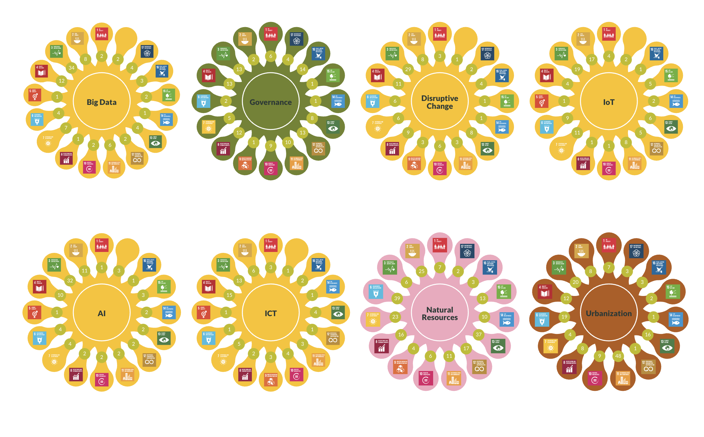
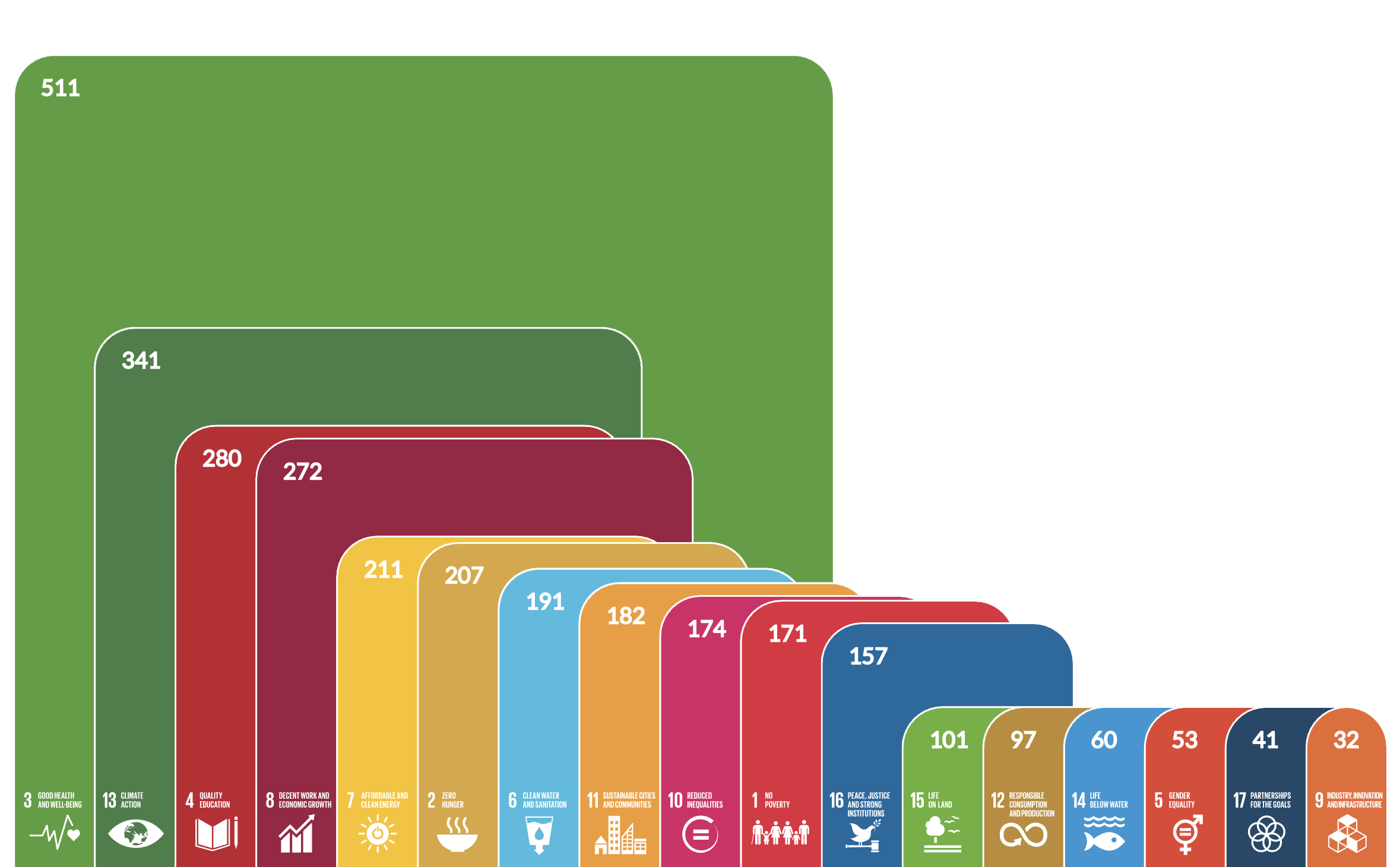
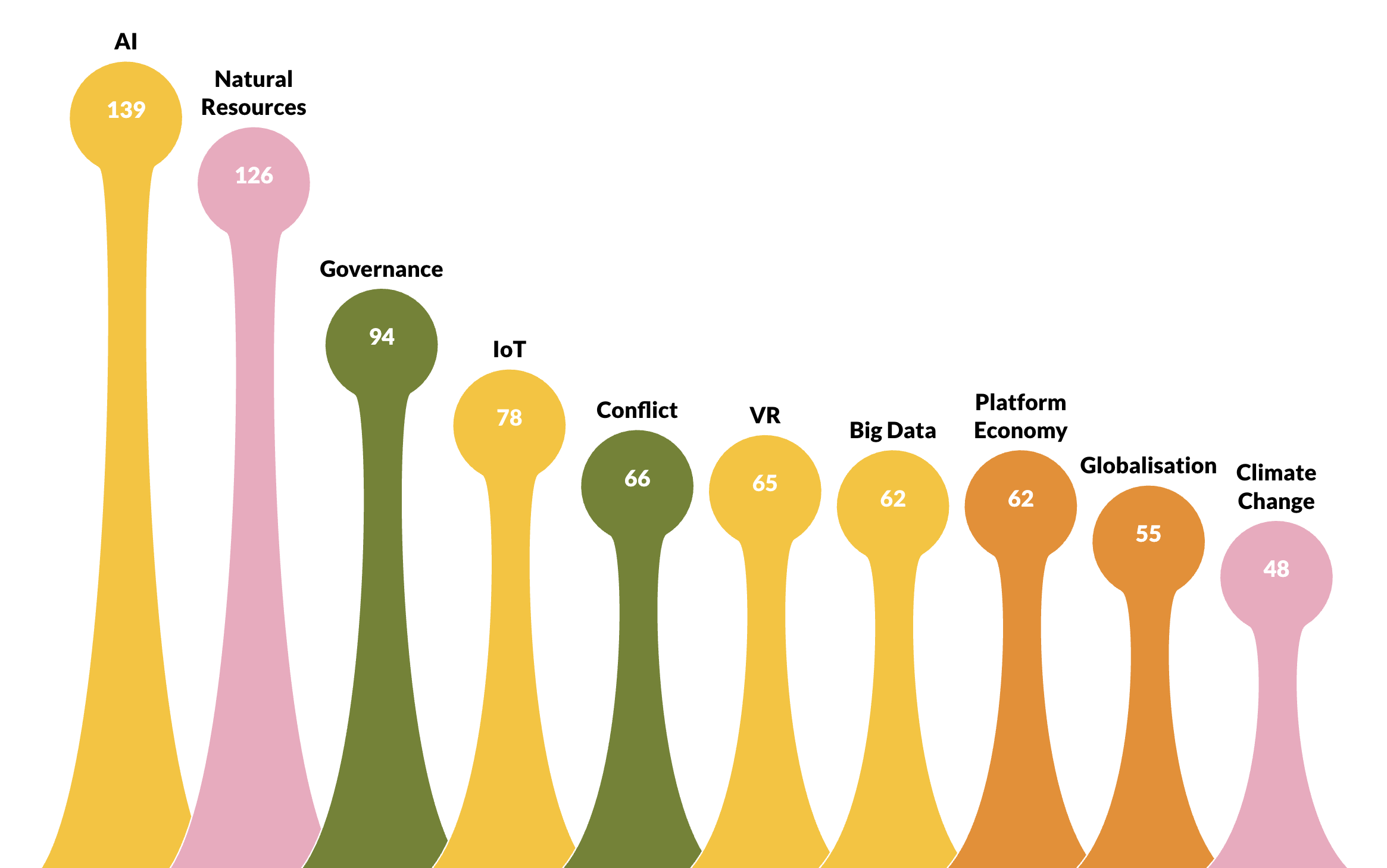
RISE // Trend Scanner
A sophisticated web-platform to allowing companies and other stakeholders to turn trend assessments into drivers for sustainable innovation. It is brought to life by a powerful filter to show the user information they can’t see anywhere elsewhere, as this data has not previously been collected in one place. Colour and animated infographics are used to make this complex data clear, concise and accessible.
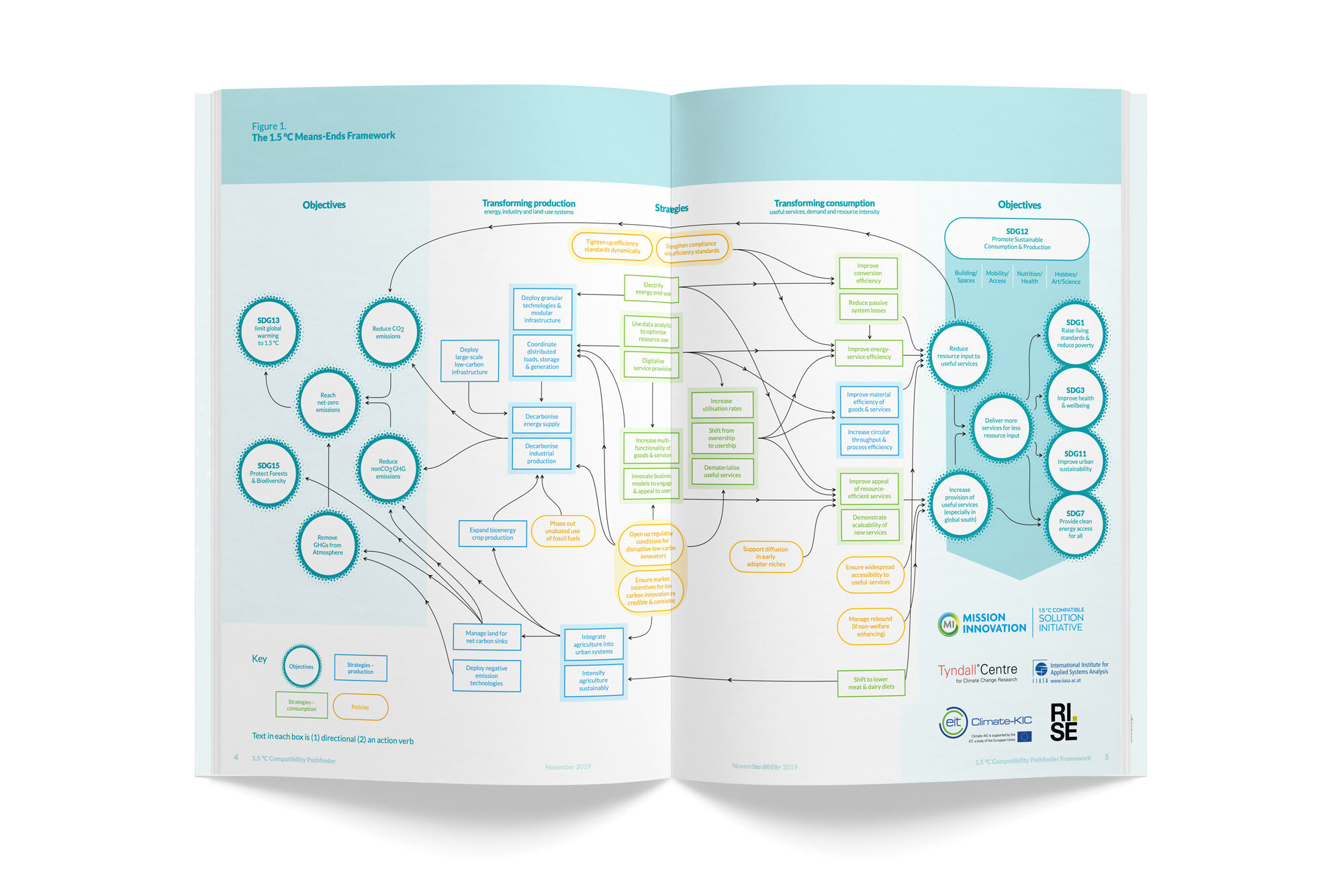
RISE // Mission Innovation
A web-platform and supporting publications for funders and investors to identify solutions and technologies that can contribute to reducing greenhouse gases, so called 'avoided emissions'.

Environment Agency // Natural Capital Approach Toolkit
This infographic is the core element for this significant document within the OXCAM LNCP project, developed to demonstrate the benefits and financial values of natural capital assets, such as farmland, woodlands and wetlands, and build understanding of the positive contributions our natural assets provide to society. The ability to quantify environmental value ensures that development considerations include natural assets and support an internationally growing need for sustainable development.

Environment Agency // Natural Capital Story and Framework
This interactive pdf establishes the importance of taking a natural capital approach, within the Environment Agency’s environmental planning and delivery framework, for both the environment agency internally, and for partner engagement and collaboration. Building on the EA brand, the vibrant look and feel, icons and infographics ensure that key natural capital cycle decision points are recognised. The new approach feels accessible and achievable, with intuitive navigation and real stories which invite engagement.
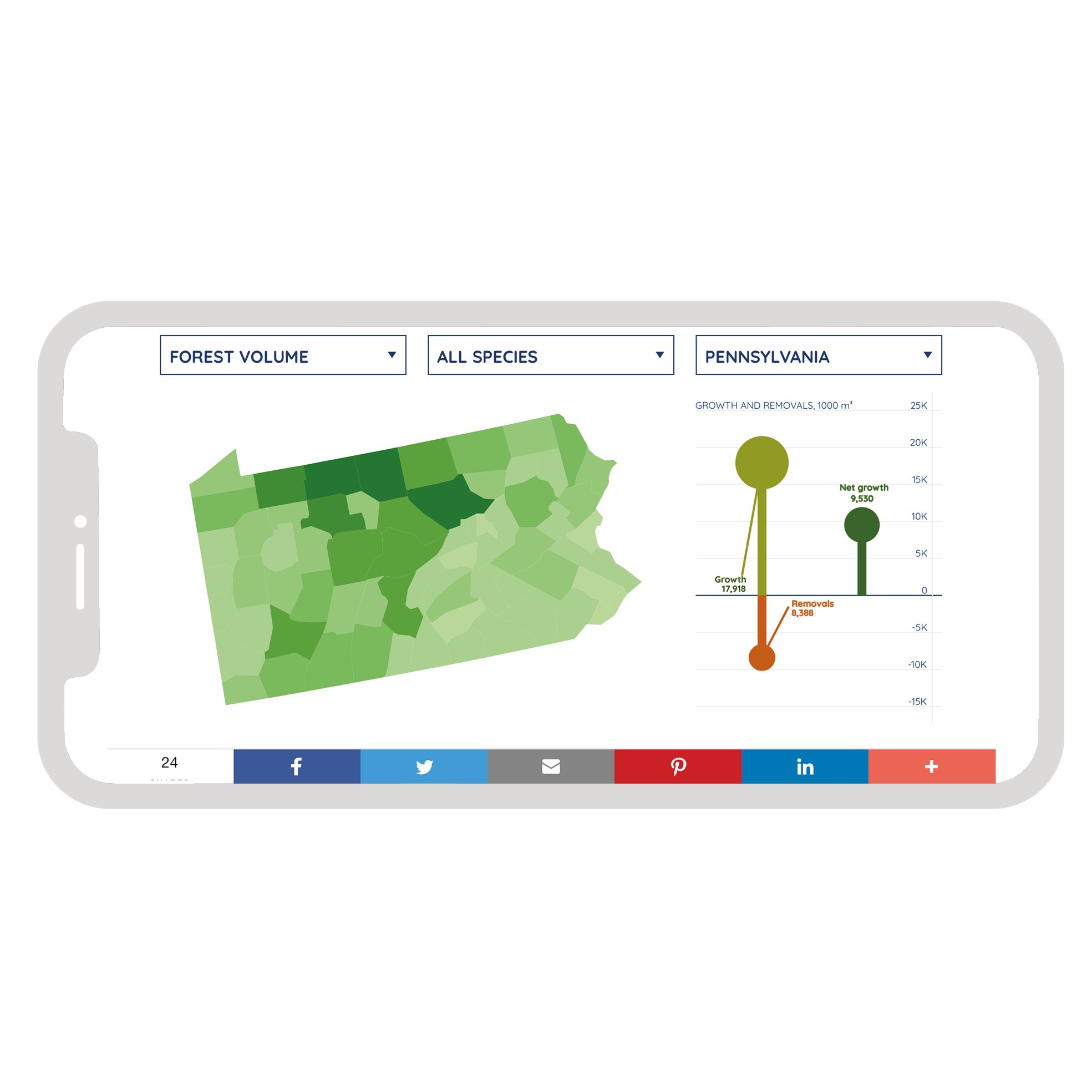
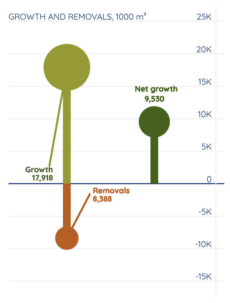
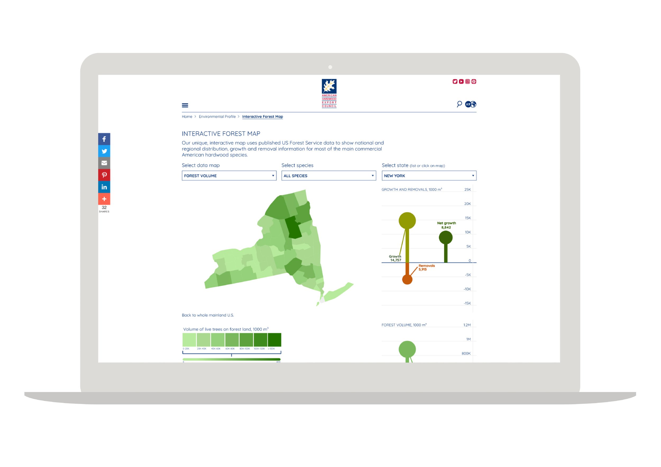
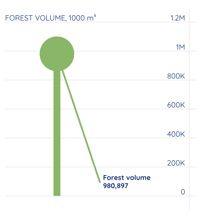
American Hardwood Export Council // Interactive forest data maps
An interactive online resource, with maps, adaptive scaling and graphic data representation, allows users to explore, compare and analyse data regarding US forest distribution, removal and growth. It also contains an online Life Cycle Assessment tool for each of the hardwood species. The data can be searched by all US Hardwood species, state and county. Both online tools use bi-annually updated data from the US government.
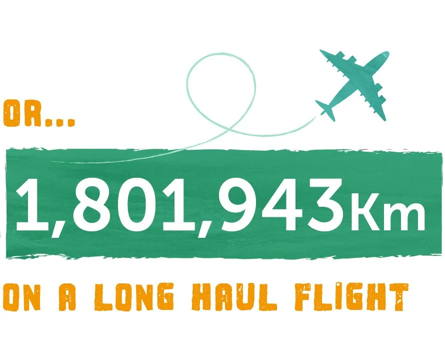
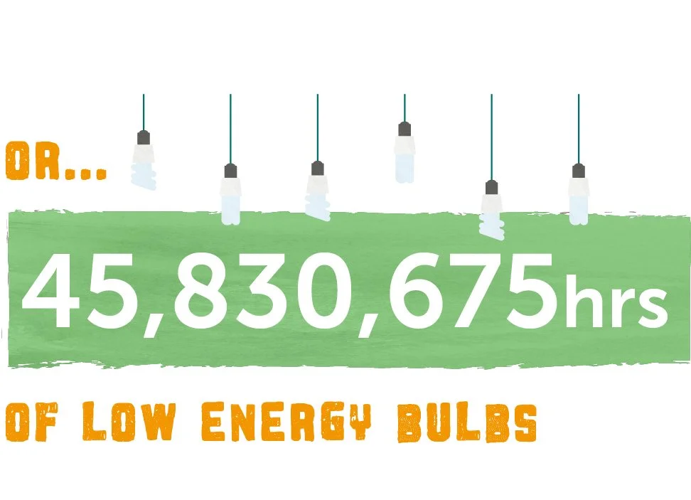
The Vegan Society // Plate Up for the Planet campaign
Watch the benefits for the planet rise on our ‘live’ online vegan calculator as part of our Plate Up for the Planet campaign, which encourages people to halve their food-related carton footprint by trying a vegan diet.


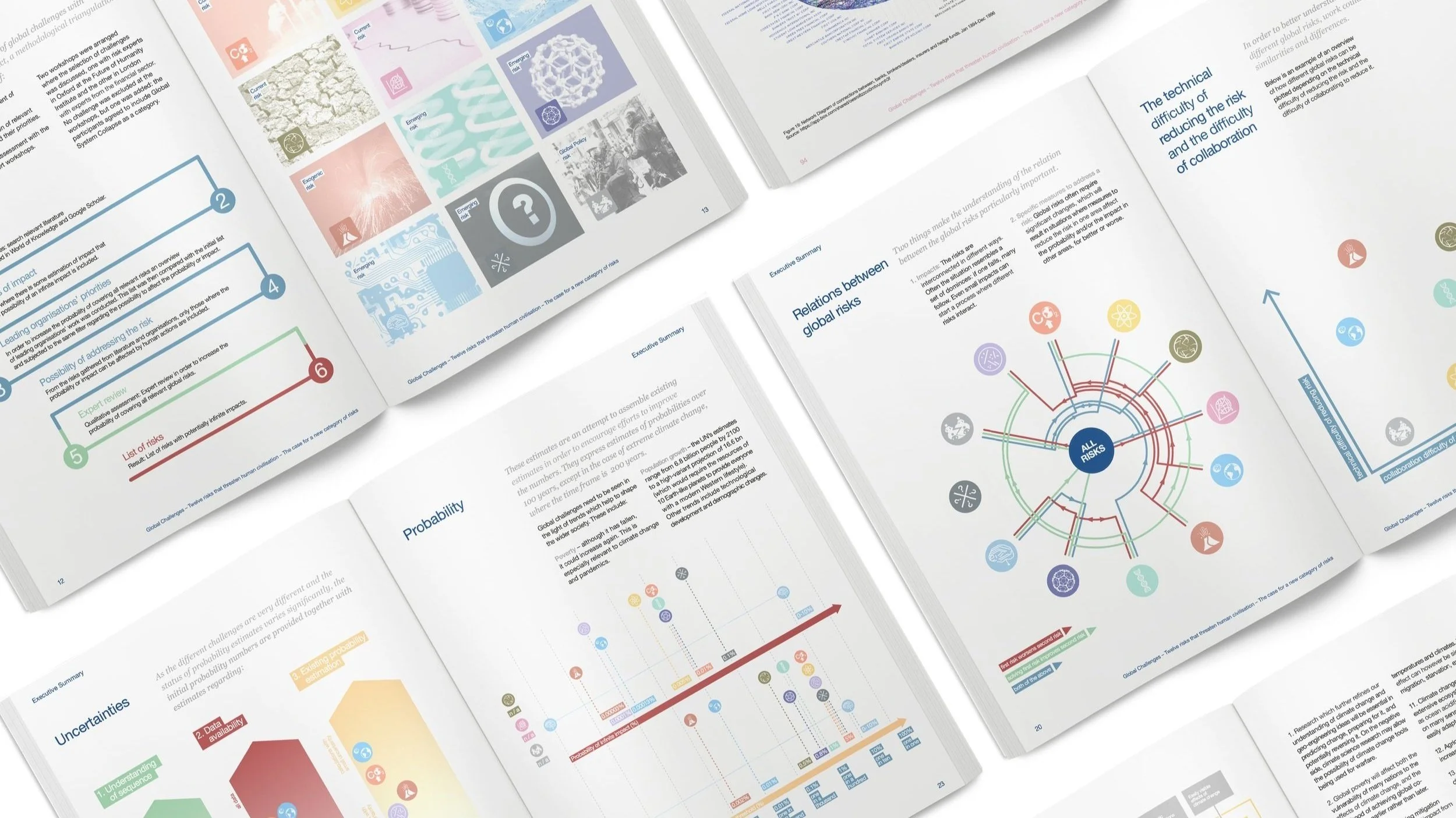
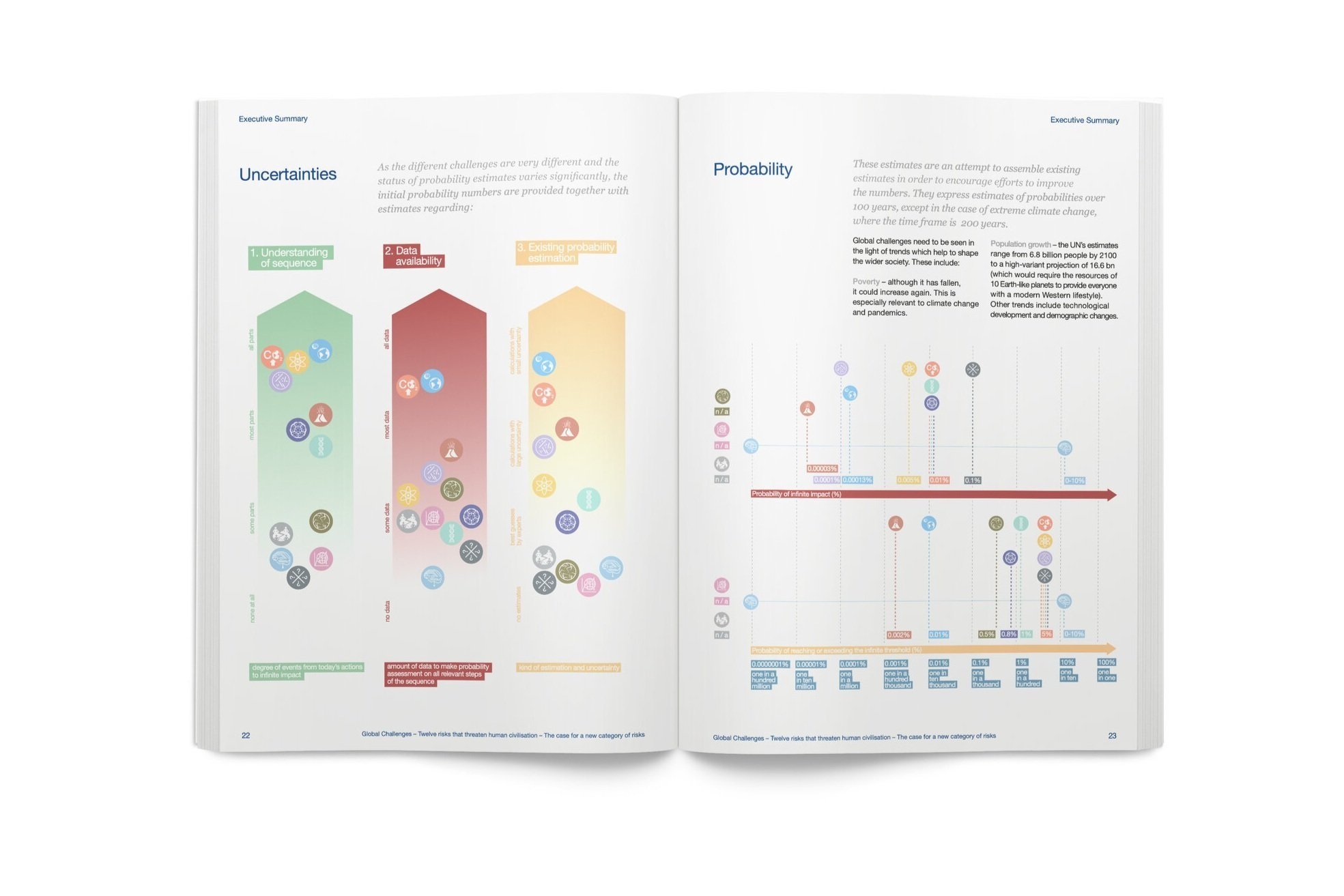
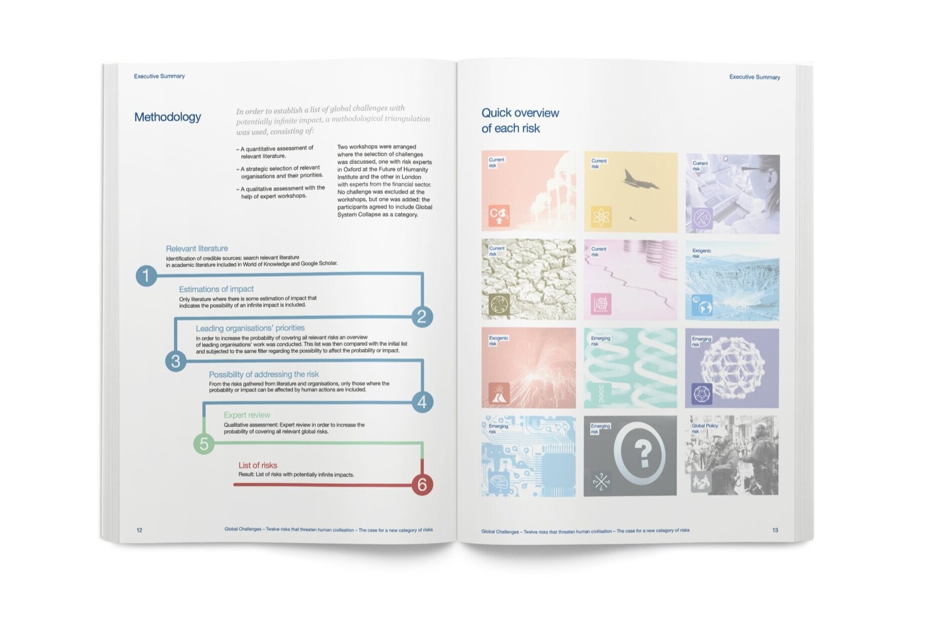
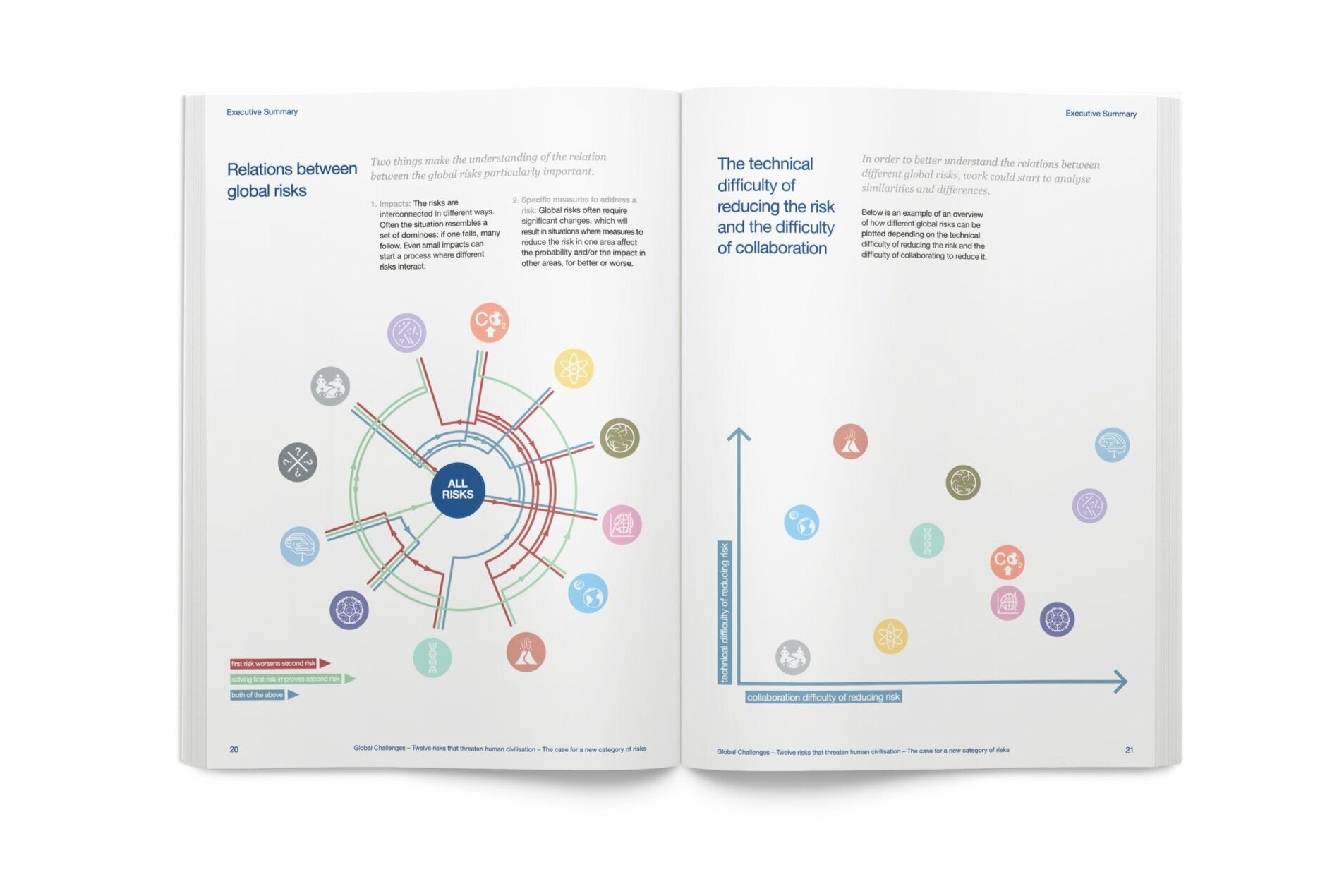
Global Challenges Foundation // 12 Risks that threaten human civilisation report
Detailed infographics explain and clarify the rationale and findings in this publication, launched at the World Economic Forum in Davos 2015, to raise awareness with world business leaders and influencers. Additional infographics support the condensed content in a partnering executive summary.